1. Project Overview
Era of We is a global coffee marketplace focused on building a more transparent and equitable coffee supply chain. A critical part of this ecosystem is coffee cupping—a standardized evaluation process that determines coffee quality, pricing, and flavour profiles used by roasters, HoReCa buyers, and end consumers.
This project focused on designing a digital cupping experience that could replace traditional paper-based workflows while preserving the precision, familiarity, and sensory focus required by professional coffee graders.
2. My Role & Team
Role: UX & UI Designer
Team: Senior UX Designer, Lead UX Designer, 3 UI Designers, Product Manager, 30+ Developers & QA, Founders
I directly owned the coffee grading flow, from understanding the domain and interaction challenges to designing and iterating on the grading interface. While working as a junior designer, I collaborated closely with senior and lead designers, incorporating their feedback while driving day-to-day interaction design decisions for this workflow.
3. Understanding the Craft: How Coffee Cupping Works
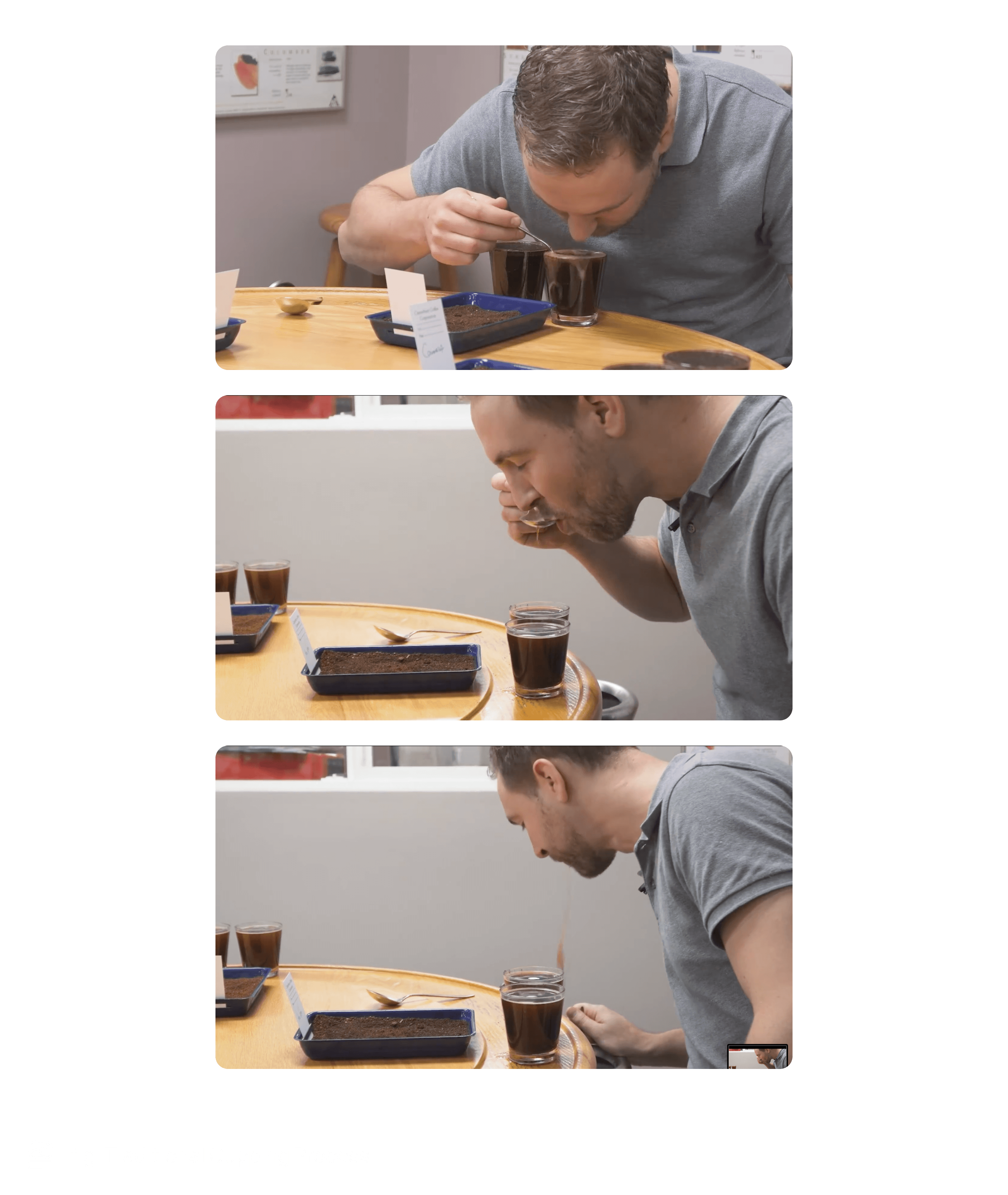
Coffee cupping is a standardized sensory evaluation used across the specialty coffee industry to assess green coffee quality and inform pricing and sourcing decisions.
During a session, trained evaluators score multiple attributes while tasting samples side-by-side. The process is deliberate and uninterrupted, relying on focus, repetition, and fine-grained judgment.
Over time, cuppers develop strong muscle memory around how they evaluate and record scores, making familiarity and predictability essential to the workflow.
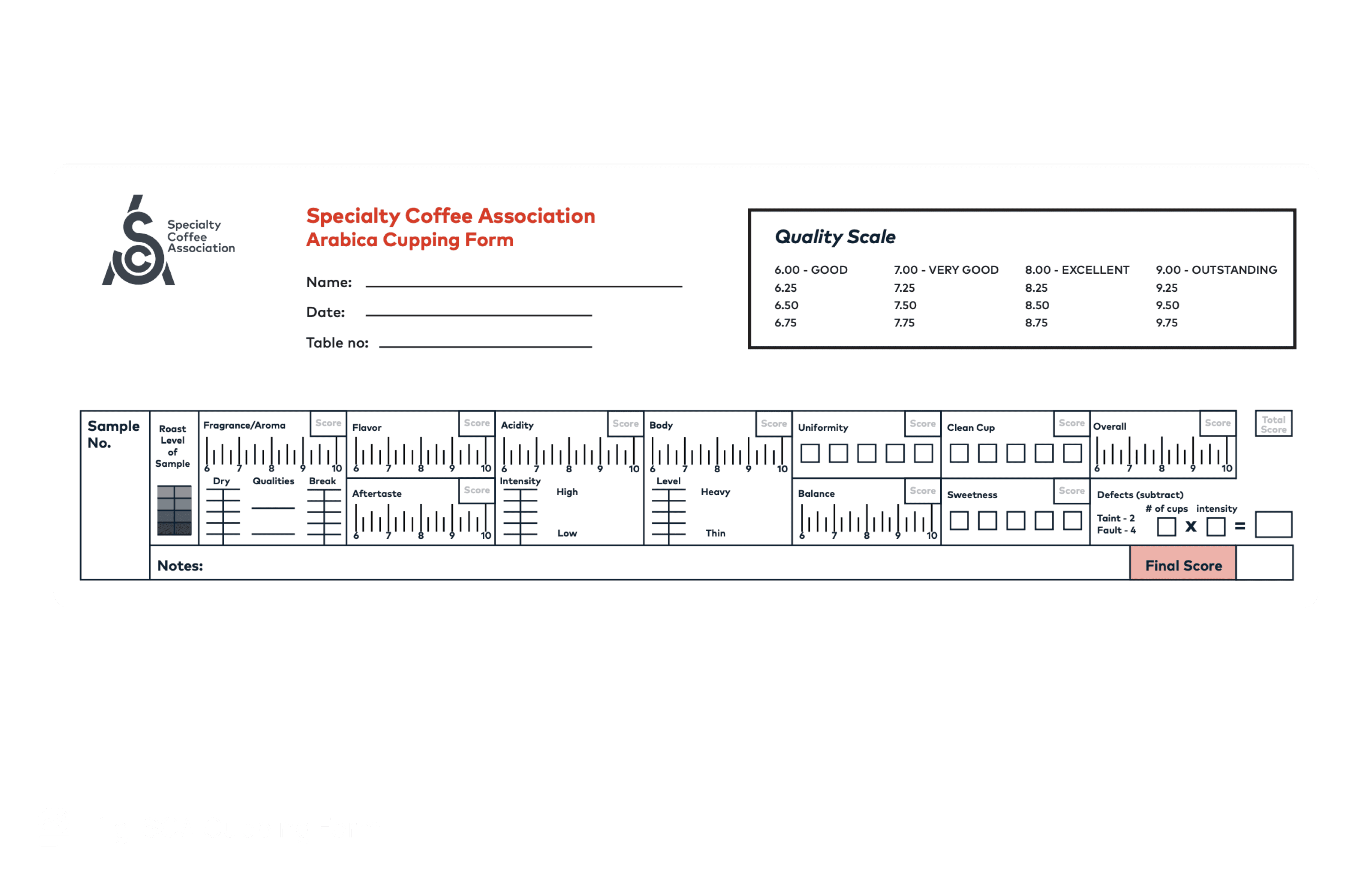
4. The Industry Standard: SCA Paper-Based Cupping Form
Professional cupping typically follows the Specialty Coffee Association (SCA) standard, which uses a dense paper form to capture scores across multiple attributes.
Despite its complexity, the SCA form is deeply trusted by graders. Its layout, scoring scale, and structure are familiar, allowing evaluators to record observations quickly without breaking concentration.
Any digital alternative needed to respect this mental model rather than replace it.
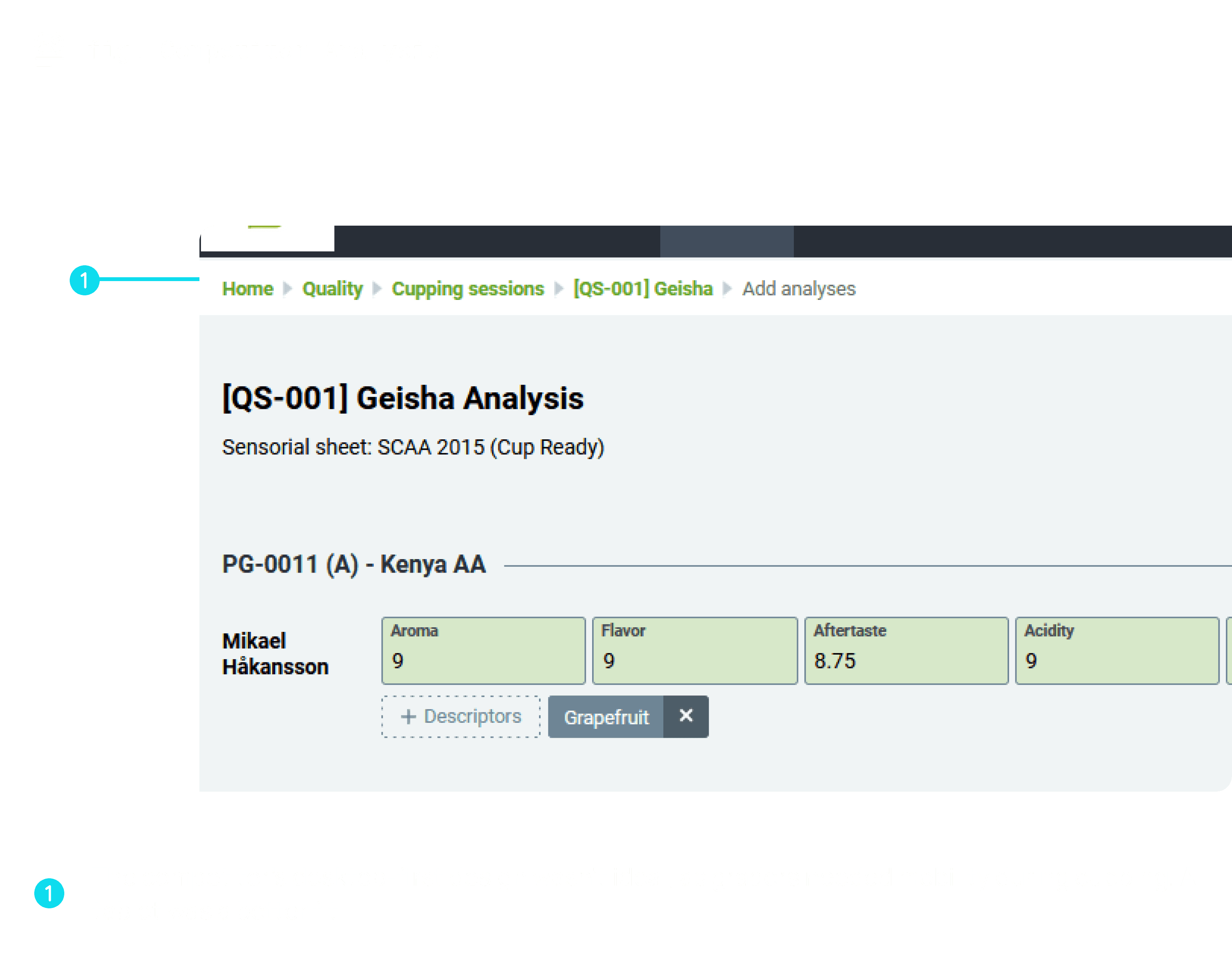
5. Problem Space: Why Existing Digital Tools Fell Short
The core failure of existing tools was not usability—it was misalignment with expert cognition.
1. Disruption of sensory focus
Cupping is a time-sensitive, sensory task. Many tools:
Required typing while tasting
Forced visual attention away from samples
Introduced interaction complexity mid-evaluation
This broke the natural rhythm of cupping and increased mental load at the most critical moments.
2. Over-optimisation for reporting, not grading
Most tools prioritised:
Post-session analytics
Rich visual dashboards
At the cost of:
Speed
Precision
Familiarity during the act of grading
They treated grading as data entry, not expert judgment.
3. Ignoring muscle memory
Paper-based SCA forms had trained graders over years.
Digital tools replaced:
Known spatial layouts
Familiar scoring scales
With:
New interaction patterns requiring relearning
This made adoption cognitively expensive, even if the tool was “usable.”
6. Design Goals & Acceptance Criteria
Based on research and stakeholder alignment, we defined the following goals:
Faithfully translate SCA grading logic into a digital format
Enable grading of multiple samples in a single session
Minimise interaction cost and cognitive load
Support tablet-first usage in real cupping environments
Provide clear, readable report visualisation
The objective was quiet efficiency—not novelty.
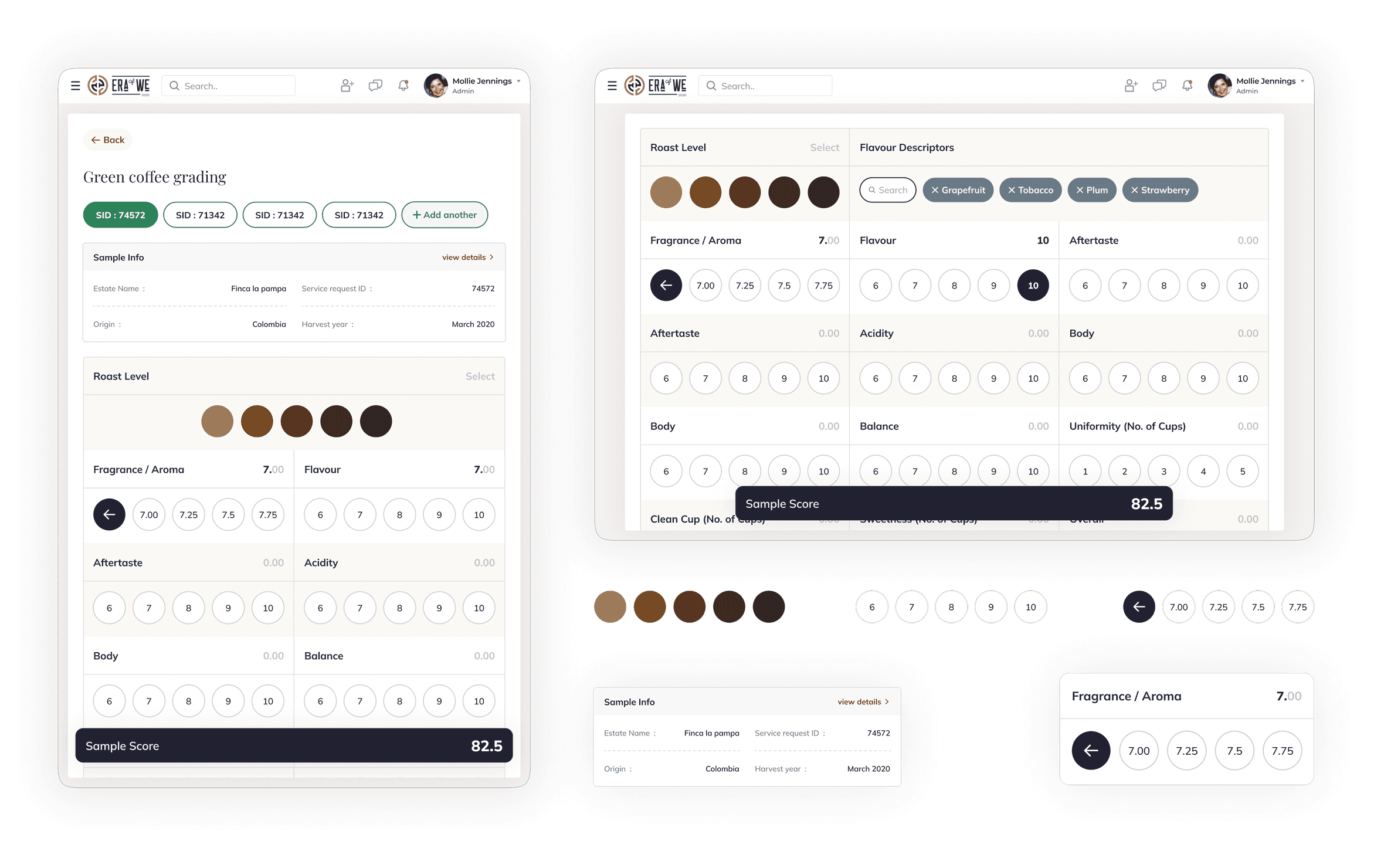
7. Interaction Exploration: Translating Paper to Digital
Rather than starting with UI patterns, we started with interaction cost.
Why typing failed
Typing:
Required multiple taps per field
Shifted focus from taste to correctness
Added unnecessary friction when grading multiple samples
When scaled across:
10 attributes
3–4 samples per session
This resulted in 120–160 micro-interactions, breaking flow.
Why sliders failed
Sliders appeared efficient but:
Made precise selection difficult
Introduced accidental inputs
Required visual verification
They optimised for speed but sacrificed accuracy.
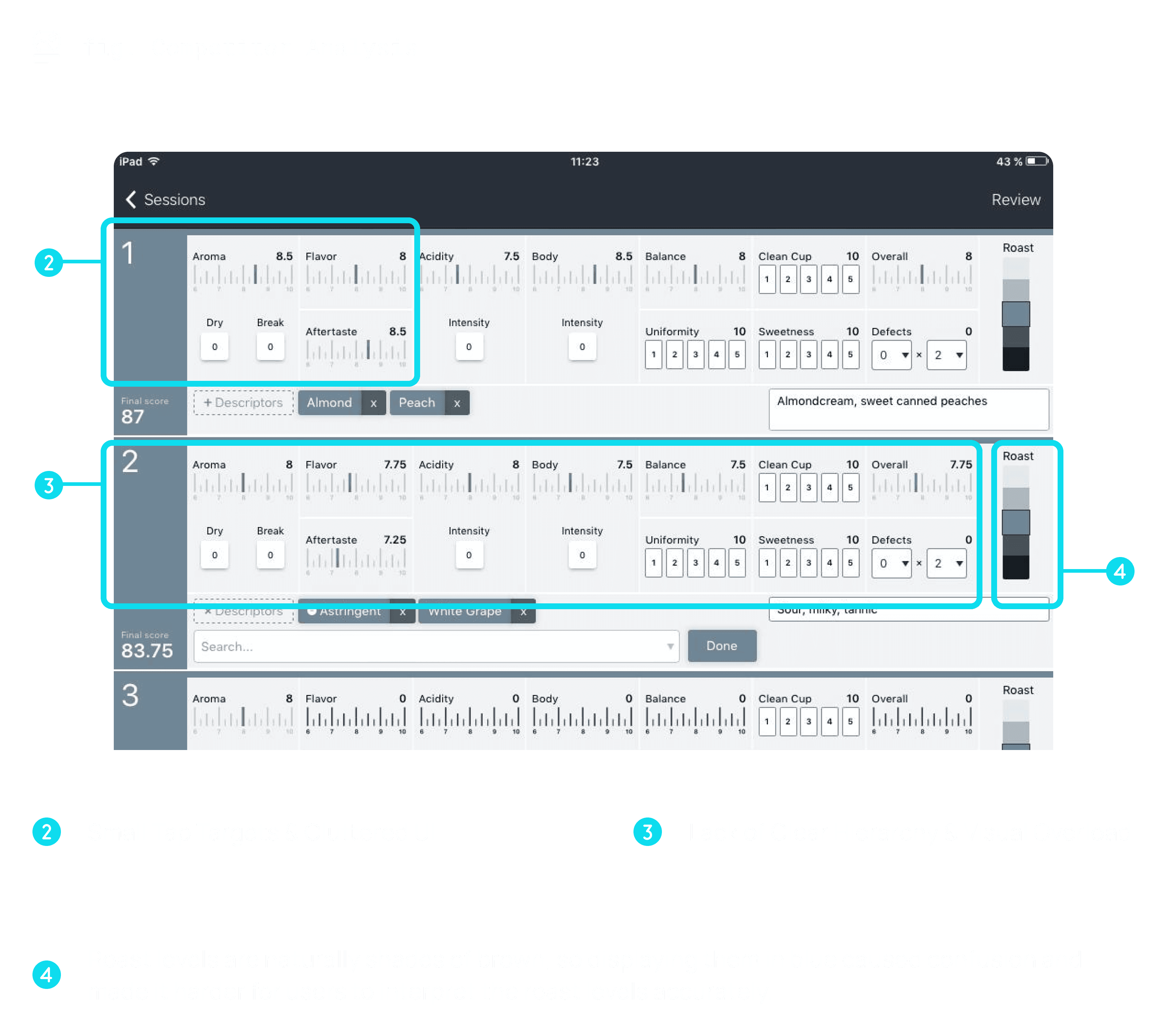
8. Refining the Grading Interaction
The final interaction model was designed around how graders think, not how interfaces usually behave.
Key decisions
Discrete, bounded scales mirrored the SCA form
Progressive exposure reduced visual noise while preserving range
Tap-first interactions supported tablet ergonomics
Spatial consistency preserved muscle memory across samples
Each decision was evaluated against a single question:
Does this let the grader stay in the tasting mindset?
The final interaction closely mirrored how graders think and score during live cupping sessions.
9. Validation & Early Feedback (MVP Phase)
This feature was developed as part of an MVP for a client, and long-term post-launch metrics were not available.
However, early qualitative feedback from certified Q graders was positive. The experience felt familiar, intuitive, and closer to pen-and-paper workflows than existing digital tools. Graders reported that the interaction allowed them to stay focused on tasting rather than data entry.
10. What We’d Measure Next If This Scaled
If the product were to scale beyond MVP, the following metrics would guide future iterations:
Efficiency
Time to complete a cupping session
Interactions per sample graded
Accuracy & consistency
Score variance across graders
Error or correction rates
Adoption & trust
Preference for digital versus paper workflows
These metrics would help ensure scalability without compromising precision or trust.
11. Reflection & Learnings
This project reinforced the importance of designing for existing expert behaviour rather than imposing new patterns. It highlighted how interaction cost can be treated as a measurable constraint and how restraint is often more effective than visual complexity when digitising physical workflows.
For expert tools, the most successful designs are often the ones users barely notice.