1. Context & Stakes
The business problem
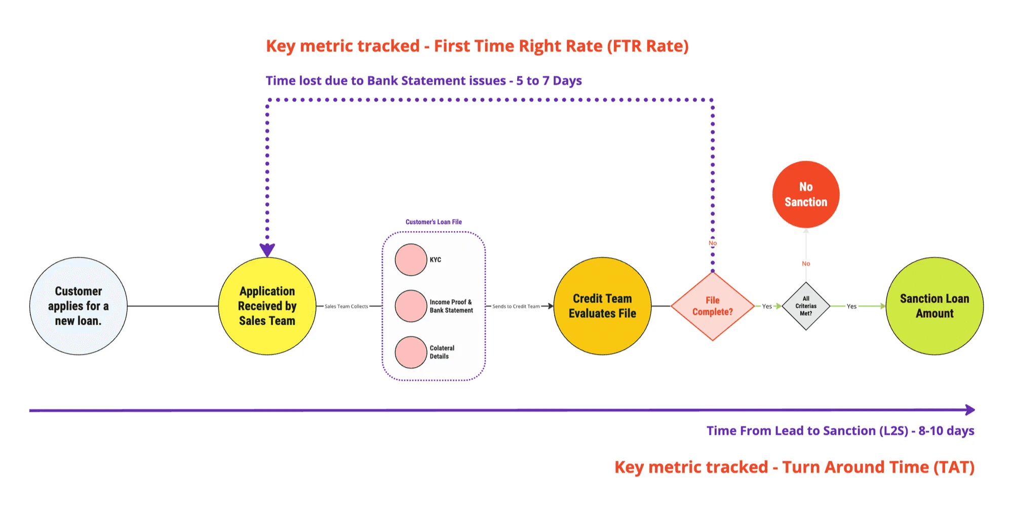
Piramal Finance was launching single-day loan disbursals, but one step consistently broke the promise.
60% of loan applications stalled during bank statement collection, inflating turnaround time by 5–7 days and directly impacting disbursal velocity.
This made two metrics critical:
First-Time-Right (FTR) — correctness of submissions
Turnaround Time (TAT) — lead to sanction duration
2.My role
As the Product Design Lead, I owned:
Problem framing & research
End-to-end UX strategy
Platform discovery with external vendors
Design decisions across mobile, system logic, and adoption mechanics
Collaboration
I partnered closely with:
Product & business leadership
Sales & underwriting teams
30+ engineers and QA
External Account Aggregator providers (OneMoney, Finvu, Anumati)
3. Understanding the Underlying Reasons Behind the Problem
What we discovered in the field
Through contextual inquiry and shadowing across 4 branches and 10+ sales executives, we discovered what initially appeared to be a simple document upload problem turned out to be a multi-layered system failure, spanning people, process, and technology.
1. Human & behavioural breakdown
Sales executives operated in high-pressure environments, often on the move. Bank statement collection was treated as a clerical step, not a risk-heavy verification task. As a result:
Photos were taken in poor lighting or at awkward angles
Statements were often incomplete or outdated
Errors were only discovered much later by underwriting teams
This created a delayed feedback loop where mistakes surfaced days after submission, increasing rework and frustration on both ends.
2. Process inefficiencies
The process assumed that:
Customers had updated passbooks
Statements were readily available digitally
Sales teams could verify correctness upfront
In reality:
Statements could span 200–500 pages due to UPI usage
Physical-to-digital conversion was manual and error-prone
Each rejection triggered back-and-forth between sales, customers, and underwriting
This made the system fragile—small mistakes cascaded into 5–7 day delays.
3. Technology limitations
From a system perspective:
Uploaded files lacked structure
Verification depended heavily on manual review
There was no way to enforce correctness at the point of entry
The system optimised for submission, not accuracy, which directly hurt First-Time-Right (FTR) and Turnaround Time (TAT).
Key insight: The system wasn’t broken because users made mistakes — it was broken because it allowed mistakes to pass silently.
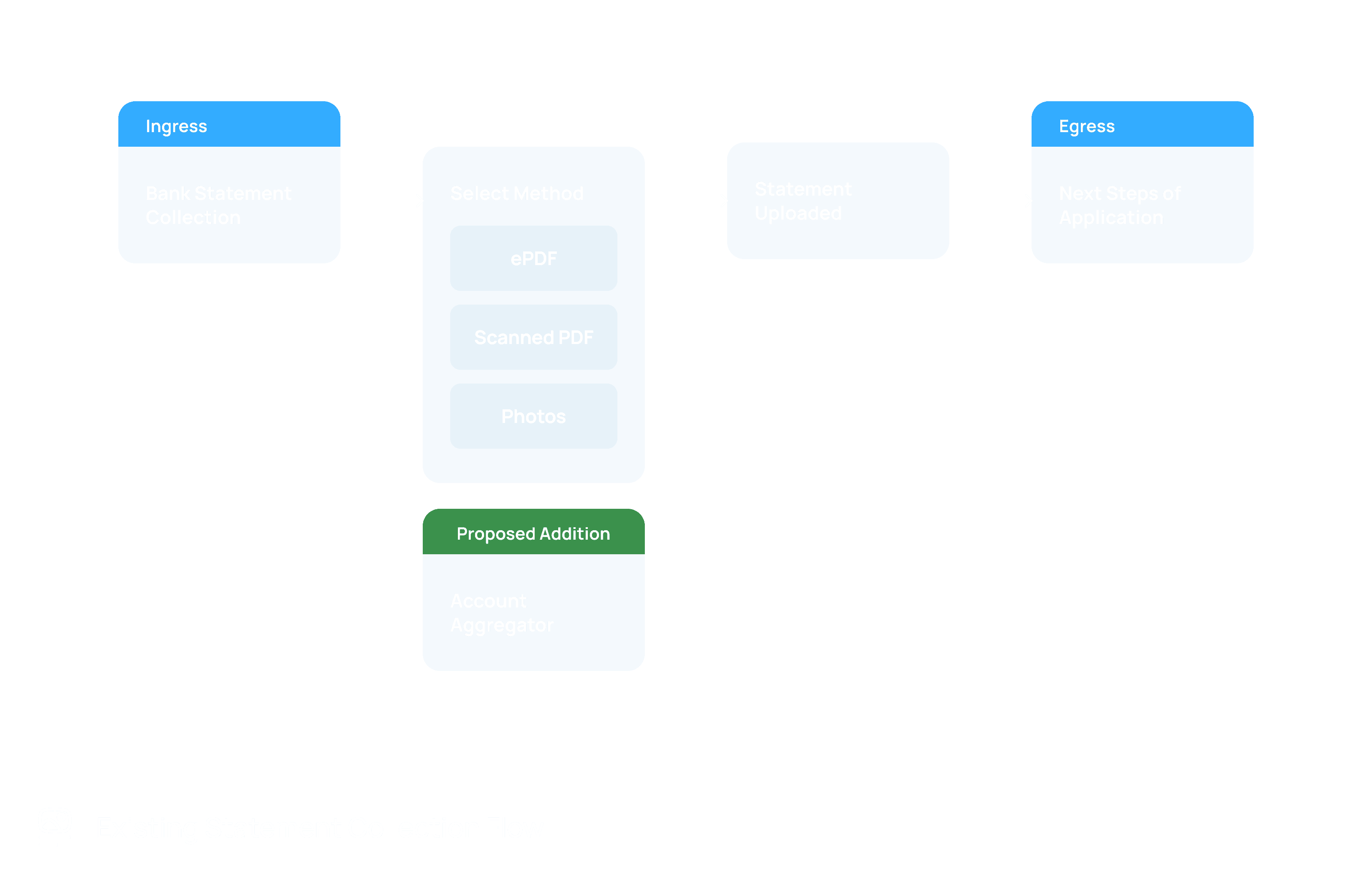
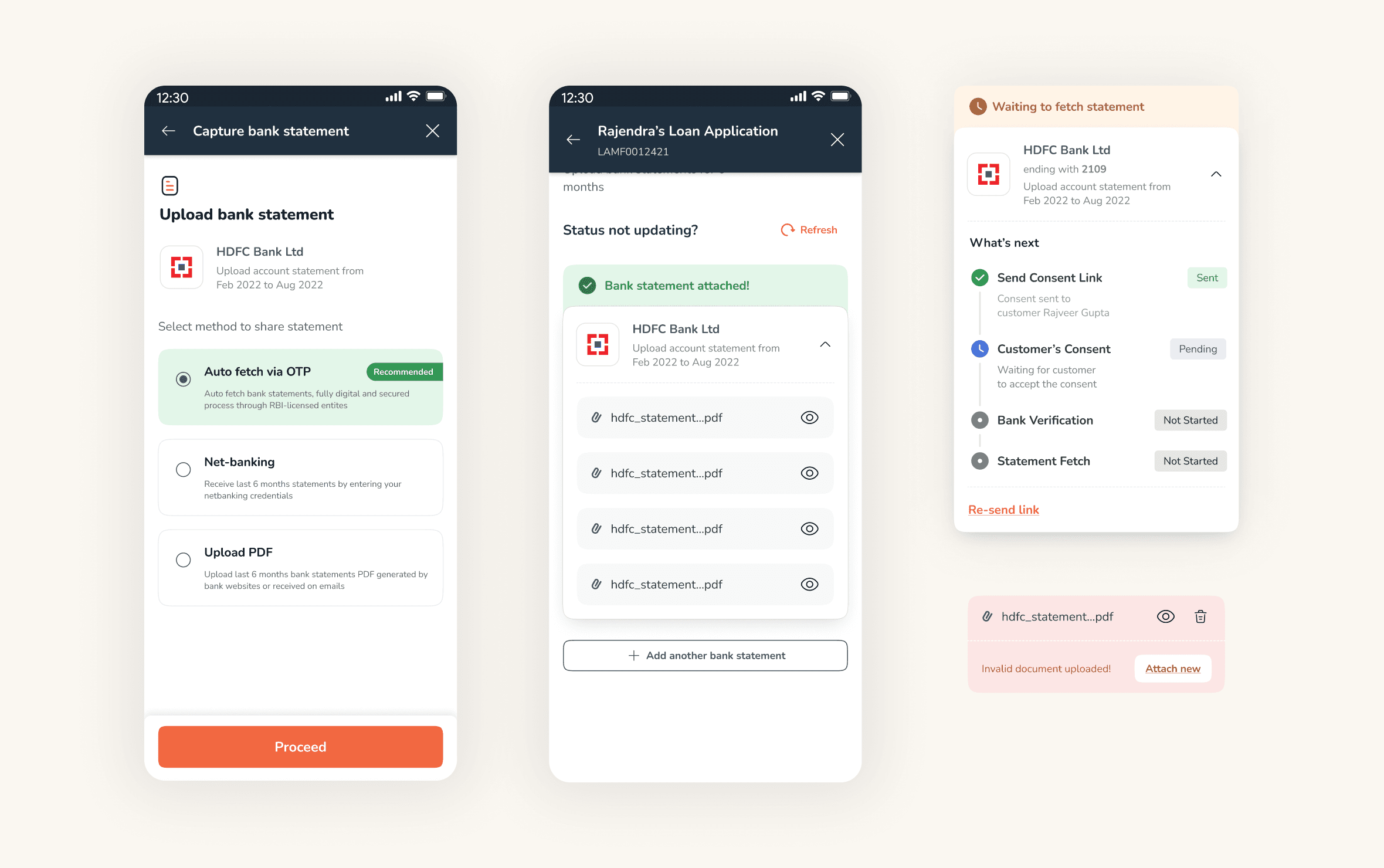
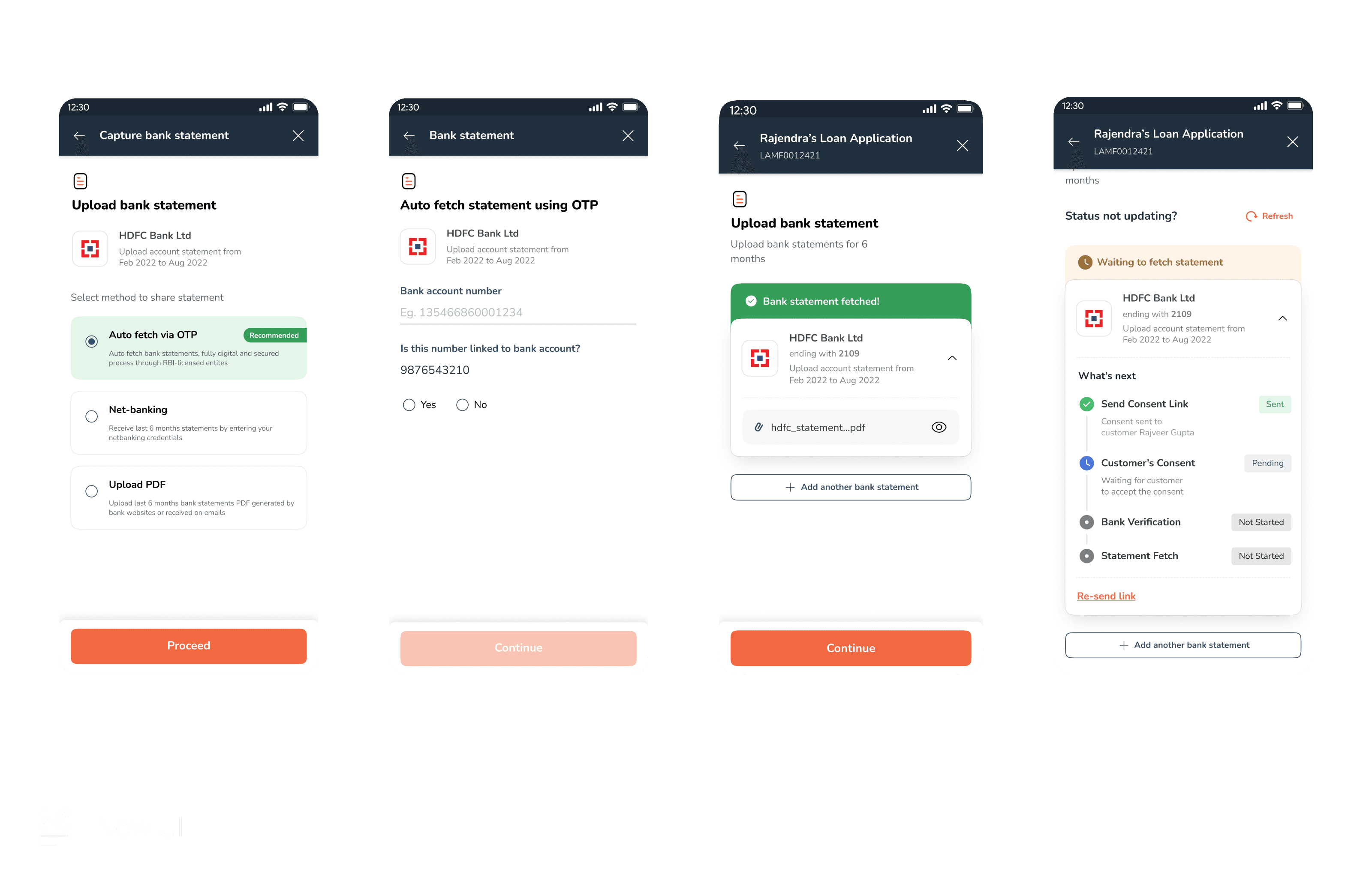
Existing System Collection Flow
4. Strategy shift: Automating trust
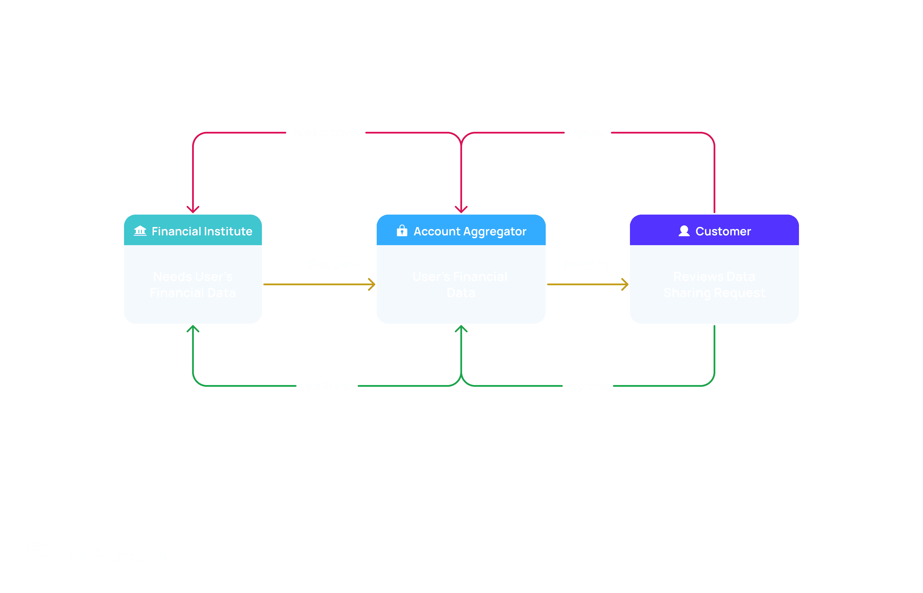
Why Account Aggregator (AA)
We aligned on using the RBI-backed Account Aggregator platform, which allows secure, consent-driven access to bank data — similar to how UPI transformed payments.
This would:
Eliminate manual uploads
Provide structured, credible transaction data
Remove ambiguity for underwriting
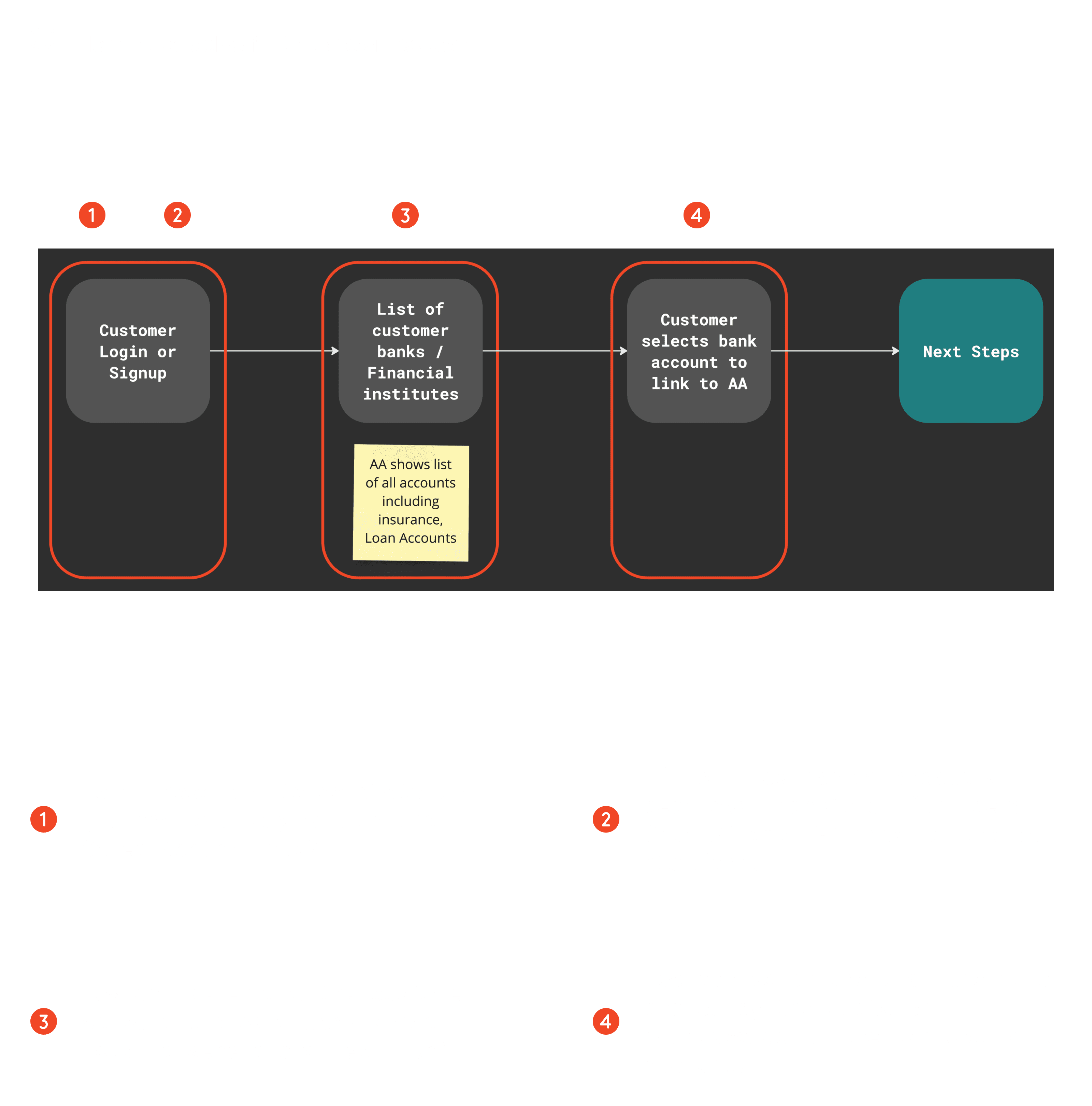
Constraint: No financial institution had implemented an assisted AA journey before.
5. Designing under platform & time constraints
Platform discovery
I worked directly with AA providers to understand:
Platform flows
Consent mechanics
Technical constraints
UI customization limits
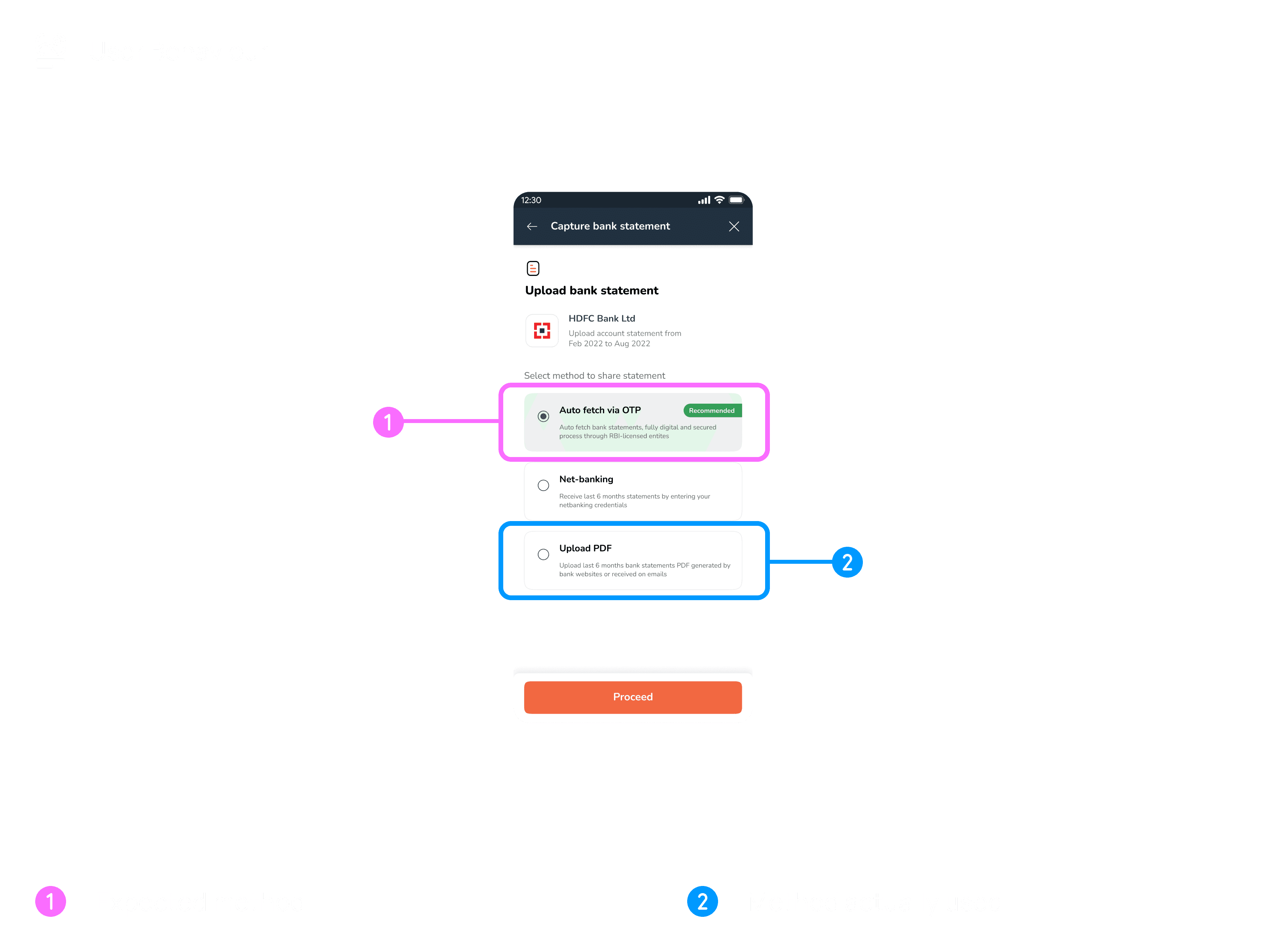
Key tradeoff
Although UI customization was possible, we chose to:
Use TPA-provided, battle-tested UI
Prioritize speed, reliability, and time-to-market
This decision reduced risk and allowed faster validation.
6. V1 failure → learning → redesign
Key Design Decisions to Reduce Errors
The design strategy focused on shifting error detection upstream, from underwriting to the moment of data capture.
Decision 1: Automate trust, don’t digitise paperwork
Rather than improving the upload experience, we questioned the premise entirely:
Why were we asking users to submit documents that already existed digitally?
Why was correctness verified after submission instead of during capture?
This reframed the problem from better uploads to eliminating uploads altogether using Account Aggregators.
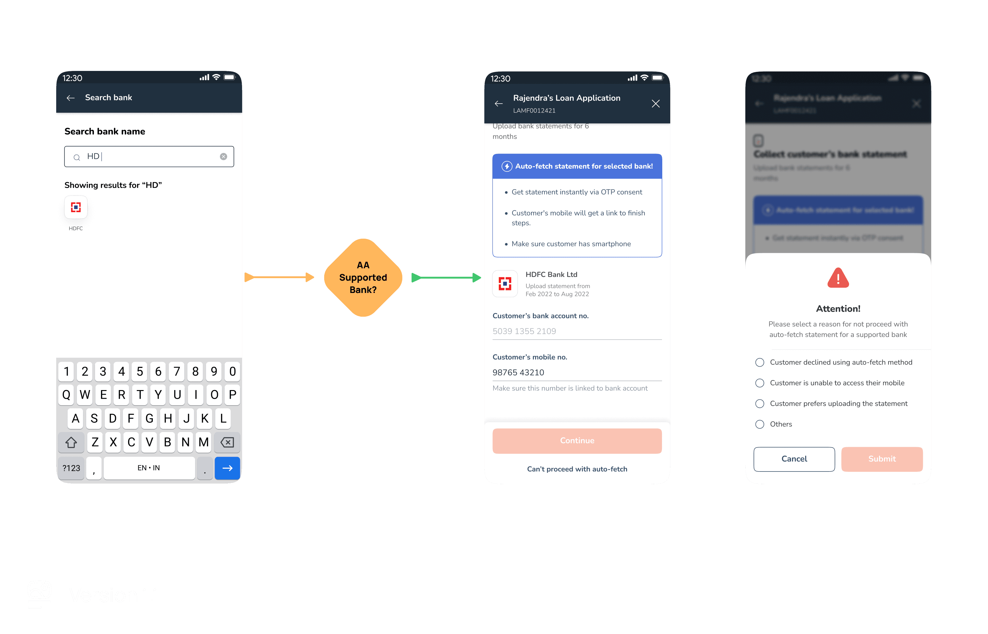
Decision 2: Design for platform constraints, not ideal flows
The AA journey was largely outside our control and dictated by third-party providers. Instead of fighting this:
We treated the AA flow as a black box
Designed our system to gracefully hand off and recover from it
This reduced integration risk and allowed faster iteration.
Decision 3: Handle edge cases as first-class citizens
We explicitly designed for:
Customers without smartphones
Unsupported banks
Poor image quality
AA downtime
Fallback flows weren’t hidden—they were validated, structured, and instrumented, ensuring underwriting received usable data even in failure scenarios.
Decision 4: Reduce cognitive burden for sales
Sales executives were not incentivised to evaluate document correctness.
So instead of expecting better judgment, we:
Encoded validation into the system
Reduced reliance on human discretion
Let the system do the policing
This aligned incentives without retraining behaviour.
What failed
Despite strong internal excitement:
V1 adoption stalled at ~2%
Sales teams hesitated due to unfamiliarity
Trust barriers outweighed efficiency gains
The insight
The problem wasn’t usability — it was behavioral resistance to a new system. So we stopped asking users to choose the better path.
7. V1.1: System-driven behavior design
The failure of V1 revealed a critical insight:
Efficiency alone does not drive adoption — trust and familiarity do.
What changed in V2
1. System-guided default paths
For supported banks:
The AA method was auto-recommended
Manual alternatives were de-emphasised
This reframed AA as the normal path, not an optional one.
2. Instrumented deviation, not forced compliance
When users deviated from the AA path, the system required them to:
Select a reason for opting out
This served as:
A learning mechanism (understanding resistance)
A governance tool (distinguishing genuine constraints from avoidance)
3. Behaviour reinforced beyond UI
Adoption was reinforced through:
Sales education
Manager-level nudges
System-level defaults
The result was a sustained shift in behaviour, not a one-time UI improvement.
8. Impact
Results
Adoption: 2% → ~70%
Even with limited AA bank coverage
FTR: 100% for AA-based cases
Zero back-and-forth
TAT: 5–7 days → ~2 minutes
Underwriting efficiency:
Structured XML data
No manual verification
Faster, more confident decisions
This unlocked true single-day disbursals.
9.Key takeaways
Designing systems beats designing screens
Adoption requires behavior design, not just UX
Failure is data — if you listen closely
Product impact often lives beyond the interface