Crafting a Seamless Digital Coffee Grading Experience
Designed a digital coffee grading experience for Era of We platform, transforming traditional SCA cupping into an intuitive interface for Q graders to evaluate coffee samples.

Overview
Era of We is a global coffee marketplace and community that brings together all members of the supply chain and shifts the value of the coffee brand back to the growers.
The coffee supply chain is unfair—farmers don’t get the profits or recognition they deserve. While the green coffee industry is worth only $20 billion, the roasted coffee and beverages market is worth $300 billion! Era of We aims to fix this by creating a transparent, sustainable, and collaborative coffee community.
My Role & Team
My Role - UX & UI Design
Team - Senior UX Designer, Asso. UX Designer (me), 3 UI Designers, PM, 30+ Dev & QA, Founders
I was responsible for designing some of the key components of the platform - Dashboards, Messaging, Coffee Grading and Settings to name a few.
Designing a Coffee Cupping Experience
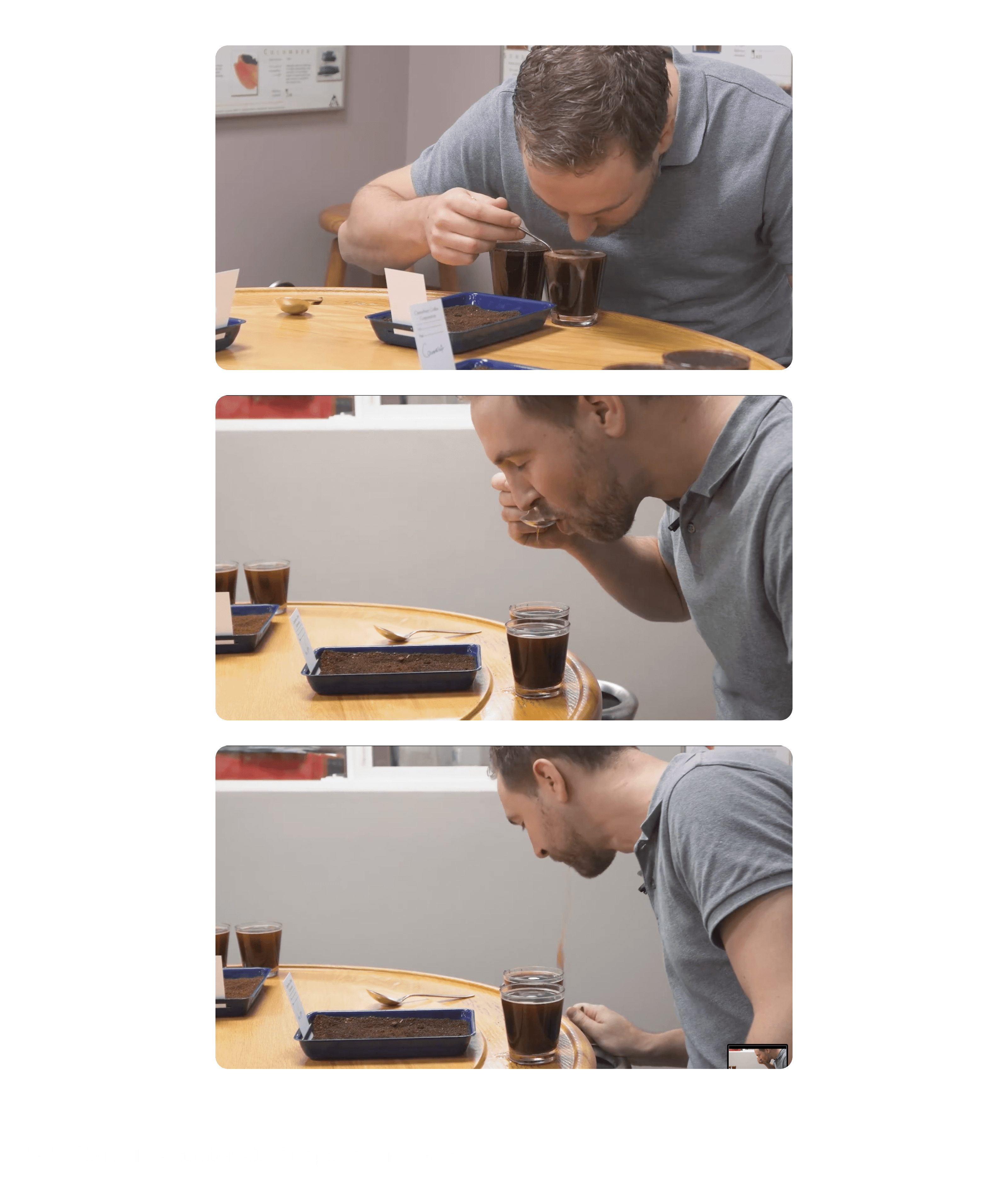
Cupping is a process of evaluating a coffee based on 3 main factors - taste, aroma and appearance.
There are many methods for cupping coffee - for our platform we were following the SCA cupping method.

Our task was to create a seamless, intuitive digital cupping experience for certified Q graders, one that respected the sensory nuances of their traditional methods.
I engaged with two certified Q graders and delved into the Specialty Coffee Association (SCA) cupping form, understanding the significance of each field.
Design Challenge
During cupping sessions, Q graders (Professional certified coffee grader) work in a dynamic environment as they evaluate multiple coffee samples at once - since Q graders immerse themselves in sensory evaluation, our design needed to minimise cognitive load—allowing them to focus purely on the art of cupping coffee. So the challenge for us was -
How might we design a digital form that's as simple and intuitive as pen and paper, while optimising it for mobile devices—especially tablets?
Competitor Analysis

Design Acceptance Criteria
The key acceptance criteria for this task were:
Creating an intuitive SCA grading form
Enabling grading of multiple coffee samples in a single session
Providing clear report visualisation
Wireframes
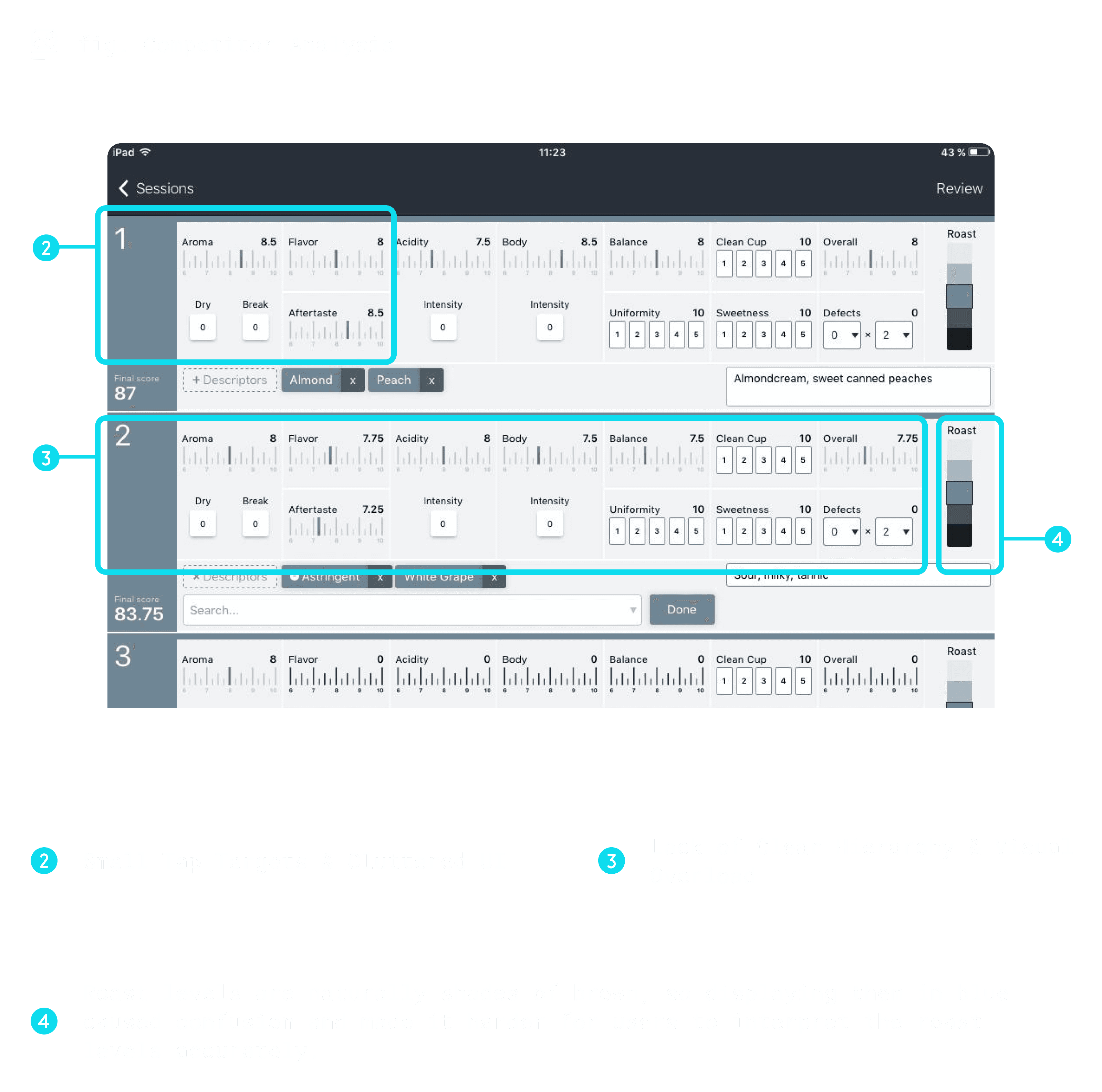
SCA Form
The SCA Form was the most important aspect of this task - getting it right would break or make the cupping experience.
Design considerations
The main drawback form the competitor analysis was that the input required user to type the desired value - however on evaluating this interaction I found that
typing requires minimum 4 tap/clicks for a single attribute (Click count 4)
the SCA form has 10 attributes (click count 40 for completion)
Last but not the least - users usually grade 3-4 samples at a time (click count 120 -160)
Typing would also shift the focus & break the sensory experience of coffee tasting to more focused on entering the correct information
a Drop-down interaction would also have similar down-side
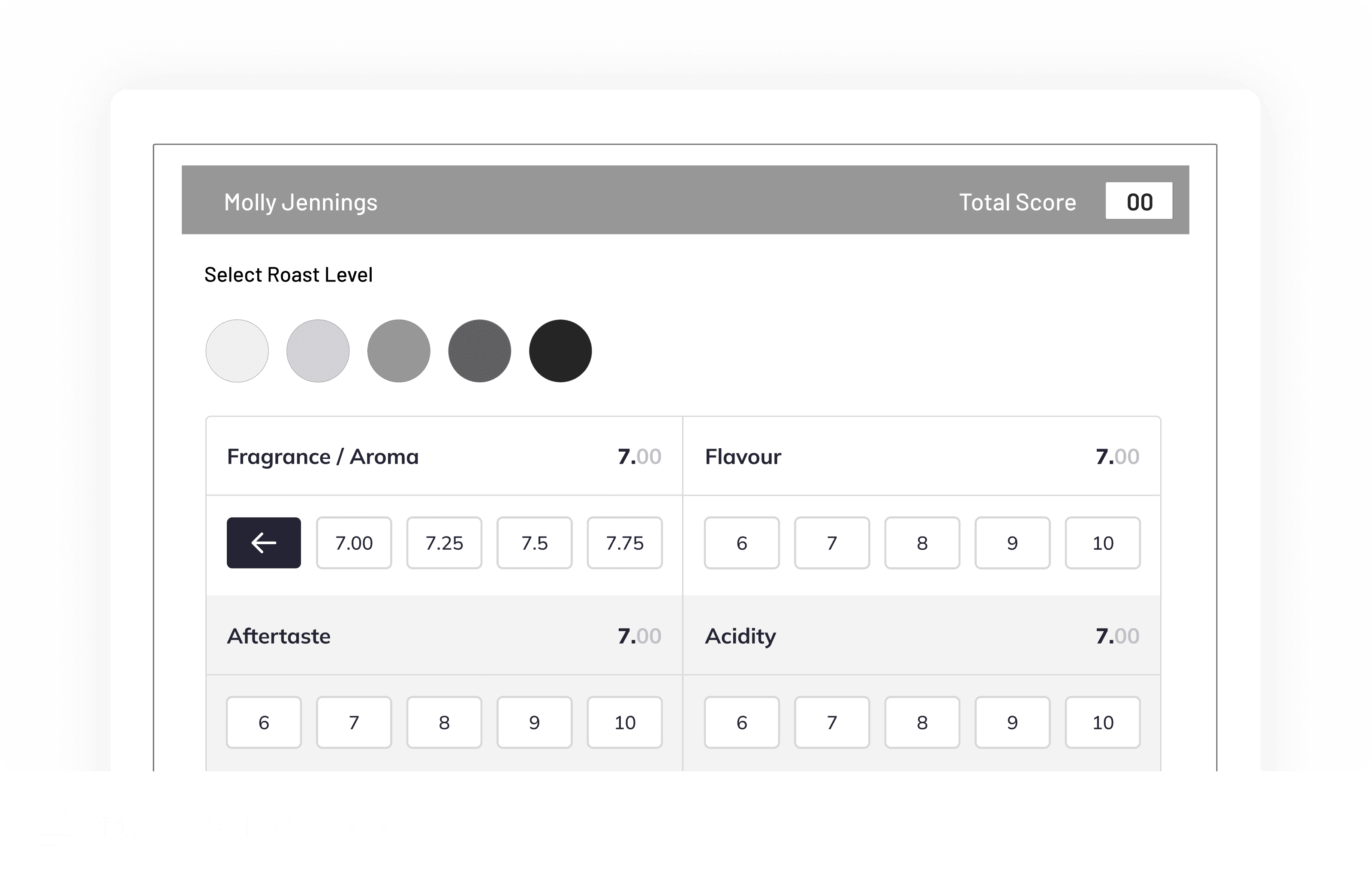
Keeping all these considerations in mind I designed the SCA from with the slider interaction -

However, peer review suggested Sliders are not the ideal interaction-
when a precise input is required
range has lot of increments
After receiving this feedback I went back to my drawing board to think of new ideas -
The result was a interactive scale - the early idea was to show the entire scale with the intermediate increments upfront

This was changed later to progressive exposed scale - which also eliminated the possibility of false touches
We further modified the scale to handle more complex cases, like Aroma evaluation, which involved two key steps—Dry Aroma (the scent of dry coffee grounds) and Break Aroma (the aroma released when stirring the brewed coffee). The scale was adjusted to capture these in the right order for a more accurate assessment.
Report Visualisation
Another key consideration was how to visualise the generated report.
We initially proposed two visualisation methods:
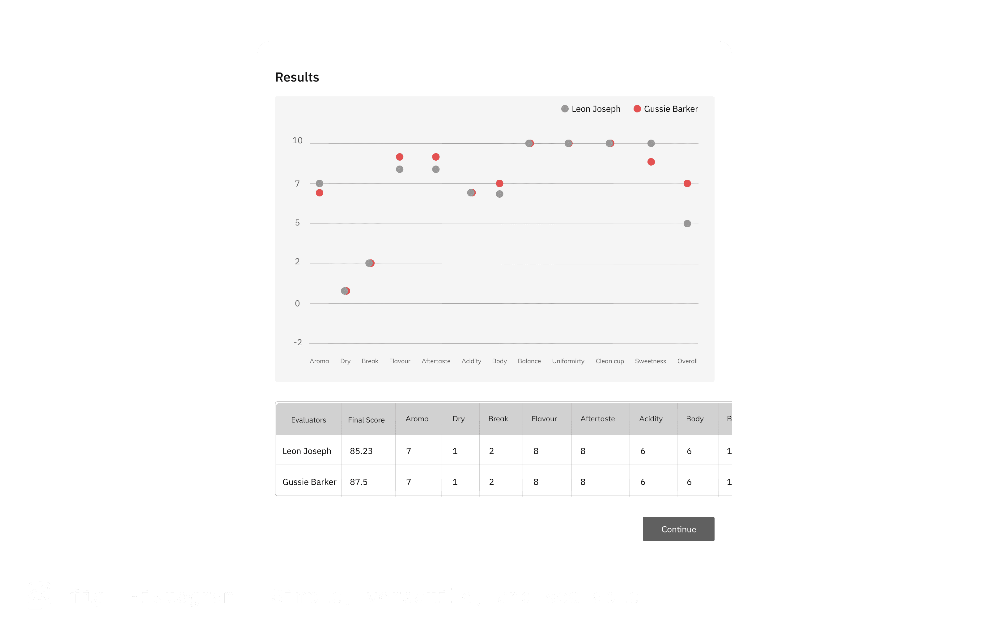

After reviewing both options, stakeholders unanimously chose the histogram representation. Radar charts were avoided due to their complexity, difficulty in comparing values accurately, and tendency to become cluttered when multiple data points overlap.
Putting It All Together
Design Journey Conclusion
Through multiple iterations and user feedback, we created a digital cupping experience that truly honors the artistry of coffee evaluation while leveraging technology's advantages.
Our final solution balanced sensory immersion with digital efficiency by:
Creating an interactive scale that reduced click count from potentially 160+ to just 30-40 for a full cupping session
Implementing a tab-based navigation system that maintained spatial awareness across multiple samples
Choosing data visualisations that prioritised clarity and scalability for collaborative sessions
This journey highlighted the importance of understanding physical interactions before digitising them, and how the right digital tools can enhance rather than replace sensory experiences.

Impact
This cupping tool was one piece of a larger vision—one that helped shape a new era of coffee by promoting sustainability, transparency, and empowering farmers to expand their reach.
The platform continues to make a meaningful difference in people’s lives.
Learnings
Iterative design is crucial for refining complex interactions.
The most impactful experiences often go beyond the screen—seamless interactions should feel natural, not deliberate.
Read next case-study